Thursday, December 23, 2010
AUDACITY: mix
I was assissigned HOPE and the songs I chose included Jumper by third eye blind, keep holding on by Avril Lavigne, on the bright side by nevershoutnever and last my heart willl go on by celine dion. I also used ocean sounds to alllow the songs to flow into each toher swiftly.
Wednesday, December 1, 2010
DREAMWEAVER_rollover button


For my website I created on Dreamweaver I choose a simple nutton to match my simple layout. For the rollover button I filled in the button black and wrote the words in white to match my black and white theme.
Friday, November 19, 2010
ILLUSTRATOR: website pages


I choses a black and white daisy for my homepage becouse I love daisies and I used a script font for my name becouse it makes my web page look classy.For my bio I deleted the daisy picture and wrote my bio. For the class overveiw I did the same but I copied the class overveiw text. Last I found a picture of illustrater and photoshop.
Tuesday, November 9, 2010
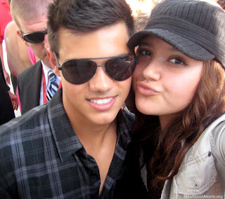
PHOTOSHOP:Montage
For my montage I used Taylor Lautner becouse he is hot. The first step I took was finding a picture of myself and one of him with a fan. I cut my head out of my picture and put it on the fans head. Next I found the beach sceanery and placed the picture of me and Taylor on it. last I cropped the picture around us.
This is the final outcome:


This is the original photo of taylor lautner:

This is the original photo of me:

this the original beach sceane:

Tuesday, November 2, 2010
PHOTOSHOP: tennis/macaroni
 when we first started the photoshop tennis the original macaroni picture was this:
next i used clipping mask to cut out a picture of maggots. i placed this picture on the macaroni and used the smoooth tool to give the illusion that the magggots blend into the macaroni.
 for the second step kevin also used clipping mask to cut out a hornets nest and added it to the picture.
 to make the third image i used clipping mask to add a baby bird and arranged it o it looked like it was eating the hornets nest
 kevins last adition was adding a hornit with clipping mask to the bird.
 my last addition was addng a mouth to the side of the photo.
Wednesday, October 27, 2010
PHOTOSHOP:combination

The orignal images were one of three elephants aginst a sunset and one of manhattan beach at sunset. First I used the layer mask skill to place the elephants at the beach and I used the inverse skill to erase the elephants backround. next I used the smoooth tool to get rid of excess white. I also added a black feathered edge. lastly I used a warter paint fiter.
PHOTOSHOP: magnetic lasso

First I found the cutest picture I could of my second favorite thing (kittens). I then made a new pink layer and named it backround. Next I used the magnetic lasso tool to cut out the kitten. last I placed it on the pink backround.
PHOTOSHOP: layer mask

To create the image of by standers running from a giant kitty I selected a picture of a kitten and one of people running from a dust cloud. To start off I first made the running people my backround and enlarged the kitty picture then I placed on the backround. I set the kitty layer to mask and then I used the inverse tool to erase any sign of the former picture besides the kitten itself.
PHOTOSHOP:Featherd Edges

to create my feathered edges project I first selected a picture that i really lked (hints the sunset). i next created a new black layer, labeled it "backround" and draged it to the bottom. ithen selected the size of the border I wanted and pressed the inverse button. last I selected a yellow font to match the sun.
Thursday, October 14, 2010
williams_flyer

On the flyer project I chose to do it on a Halloween dance. While creating the flyer I used many skills I learned in class. For example I used text on a path for my catch phrase. I used clipping mask for the word Halloween. And last I used combining shapes to create the crescent moon.
My project included many elements of design. Theses elements include color, lines, and shapes. I used analogous colors like orange, red, yellow, and brown to give the Halloween/ autumn effect. I used shapes like stars and circles, squares, triangles, and lines. I used circles and lines to make music notes, squares and circles to make a boom box, and circles and triangles to make the jack-o-lantern.
I also used many principles of design. I used contrast, unity, and emphasis. The colors I chose orange, red, brown and yellow were similar to each other which showed contrast. The unity was shown with the many stars that resembled a night sky. The emphasis was towards the huge Halloween text in the middle of the page.
Wednesday, September 29, 2010
ILLUSTRATOR: Combing Shapes SnowFlake
To make a snowflake I created one polygon then another but rotated the second one and placed to on top of the first. Next I selected the two and pressed the add button. I then begain to create a series of thin rectangles turning then on an angle and placeing them diagnally on the shape then subtracting them one by one.

Tuesday, September 28, 2010
ILLUSTRATOR: Combining Shapes
First I used the shape tool to create a polygon. Next I made a star and praced it obove the polygon but still touching. Then I selected both images and pressed the add button, this connected both fugures. Next I created a star under the poygon and selected both figuers then selected the subtract button thus finishing my first figure. To make the second figure I did the same thing but instead of a polygon I used a cirlce.

ILLUSTRATOR: Name On A Path

first i used the pencil toll to draw a sqiggly line. Next a chose i pattern and font for my text. Then i used the type on a line tool to write my name.
ILLUSTRATOR: MD On a Path
First i drew a swirly shape with the pencil tool. Next i selected a size font, stoke size, and word color. I then selected the type on a path tool and typed "MULTIMEDIA AND DESIGN". Becouse my my words were not long enough my text only curved once however i threw the line so it could c urve twice.
 urve twice.
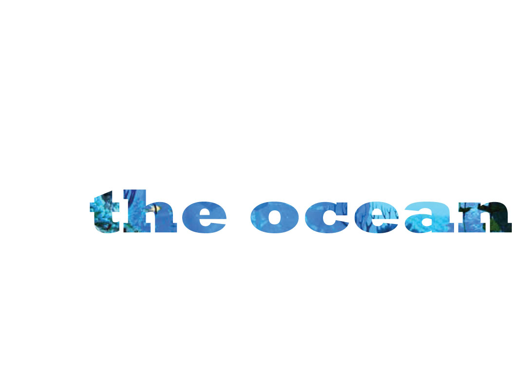
ILLUSTRATOR: Clipping Mask
description: I love the ocean so i found a ocean picture on google. i place the picture on the page and wrote the word "ocean" in large bold font. Next i selected both images and pressed the object button then the clipping mask. This allowed my word to be fillled with the image behind it.
Monday, September 20, 2010
welcome!
hi! my name is joyce and i will be useing this blog as a profolio for my multimedia and design class. i will be posting my projects and examples along with breif description of what i did. please check back to see my work!
Subscribe to:
Comments (Atom)